Mau - Product Design and UX | Vistaprint
625
portfolio_page-template-default,single,single-portfolio_page,postid-625,ajax_fade,page_not_loaded,,qode-theme-ver-6.2,wpb-js-composer js-comp-ver-7.9,vc_responsive
 

Vistaprint

Welcome to this sneak peek of my time at Vistaprint. Enjoy.

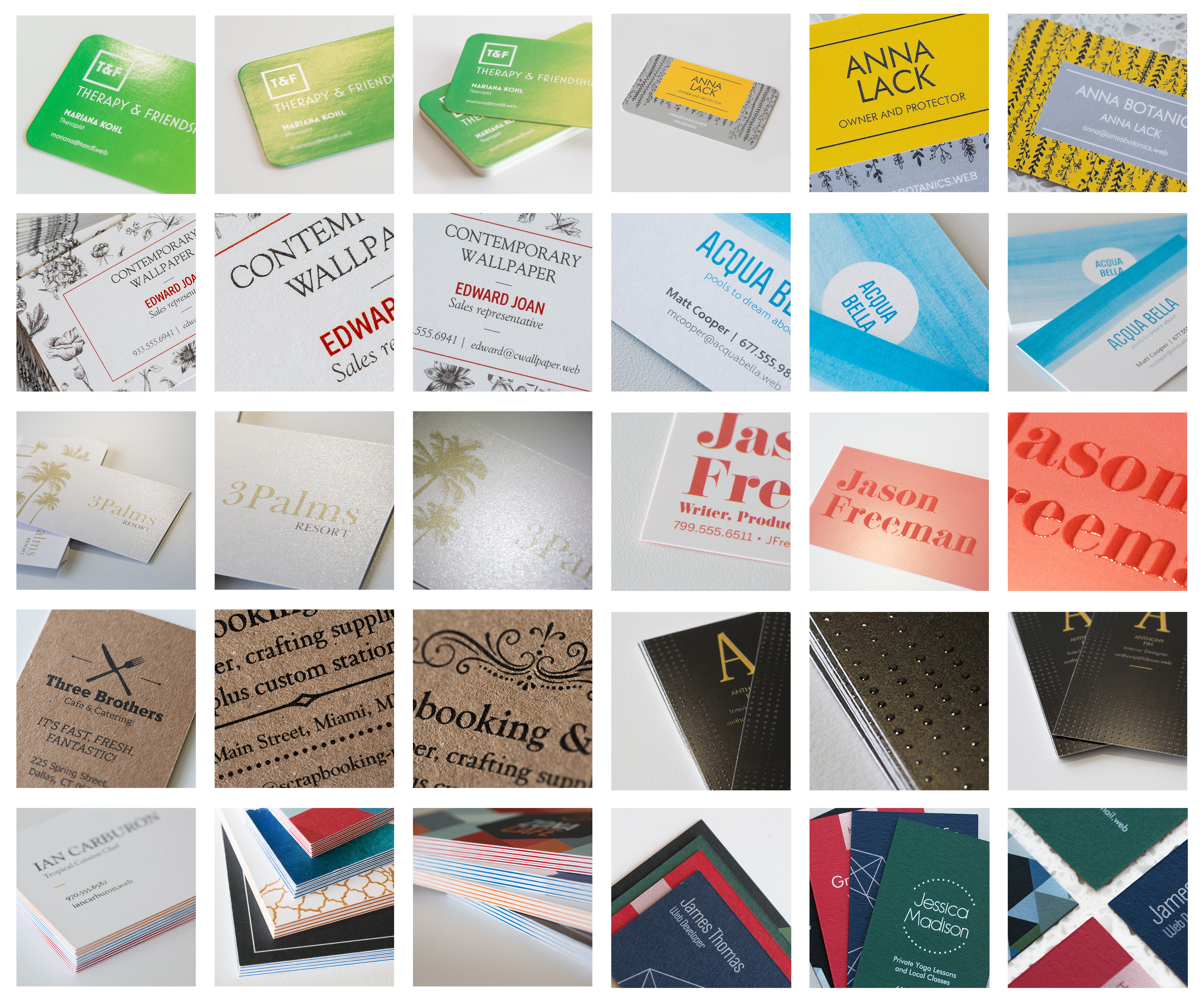
This is an abbreviated collection of the work I did at Vistaprint, a company whose vision and mission I genuinely love – to empower micro and small business to look their best. My time of Vistaprint really instilled in me a deep respect for my colleagues of adjacent disciplines and built in me a whole different depth of passion and empathy for users. I am confident you will enjoy the long scroll.

Flexible Configuration Phase 1


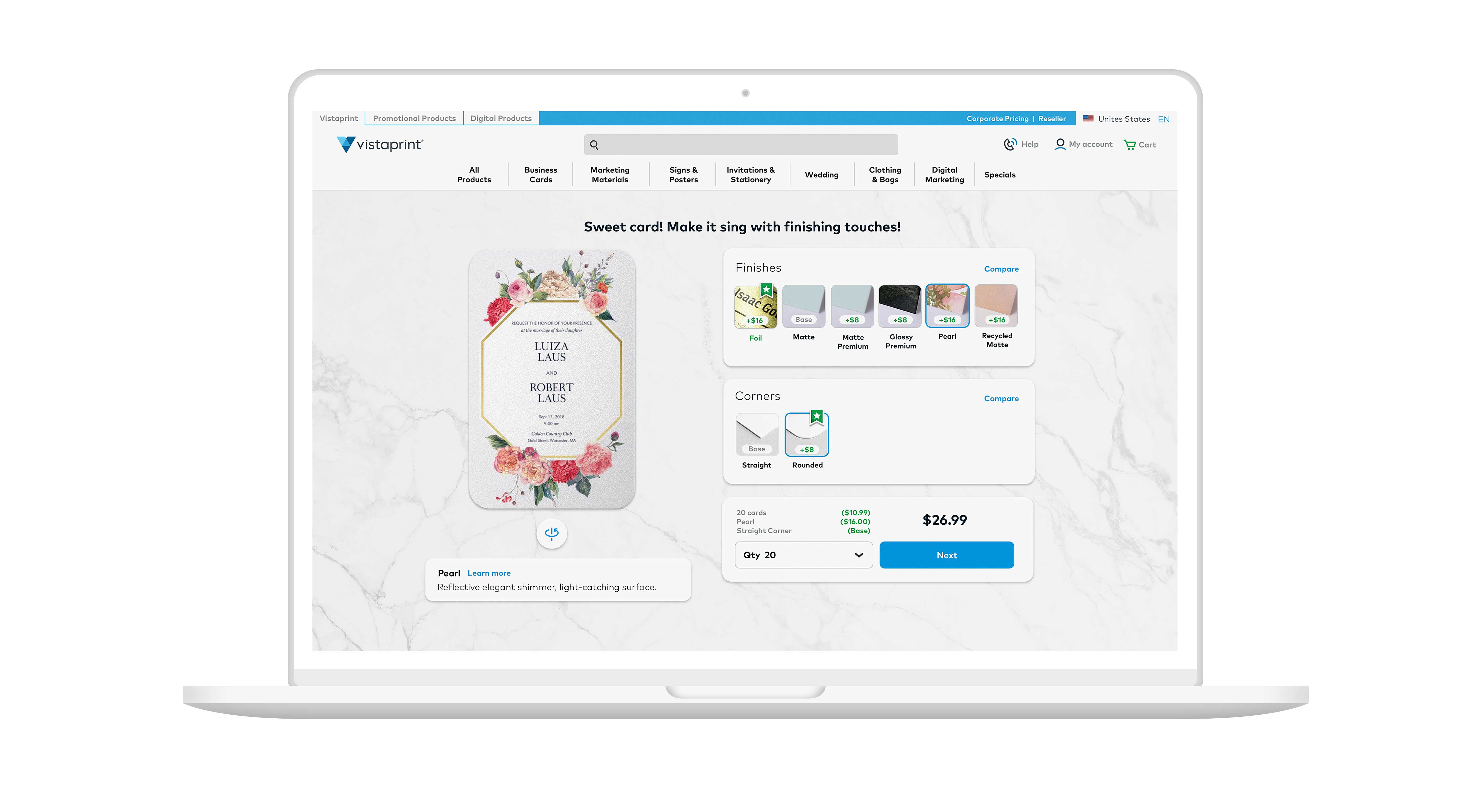
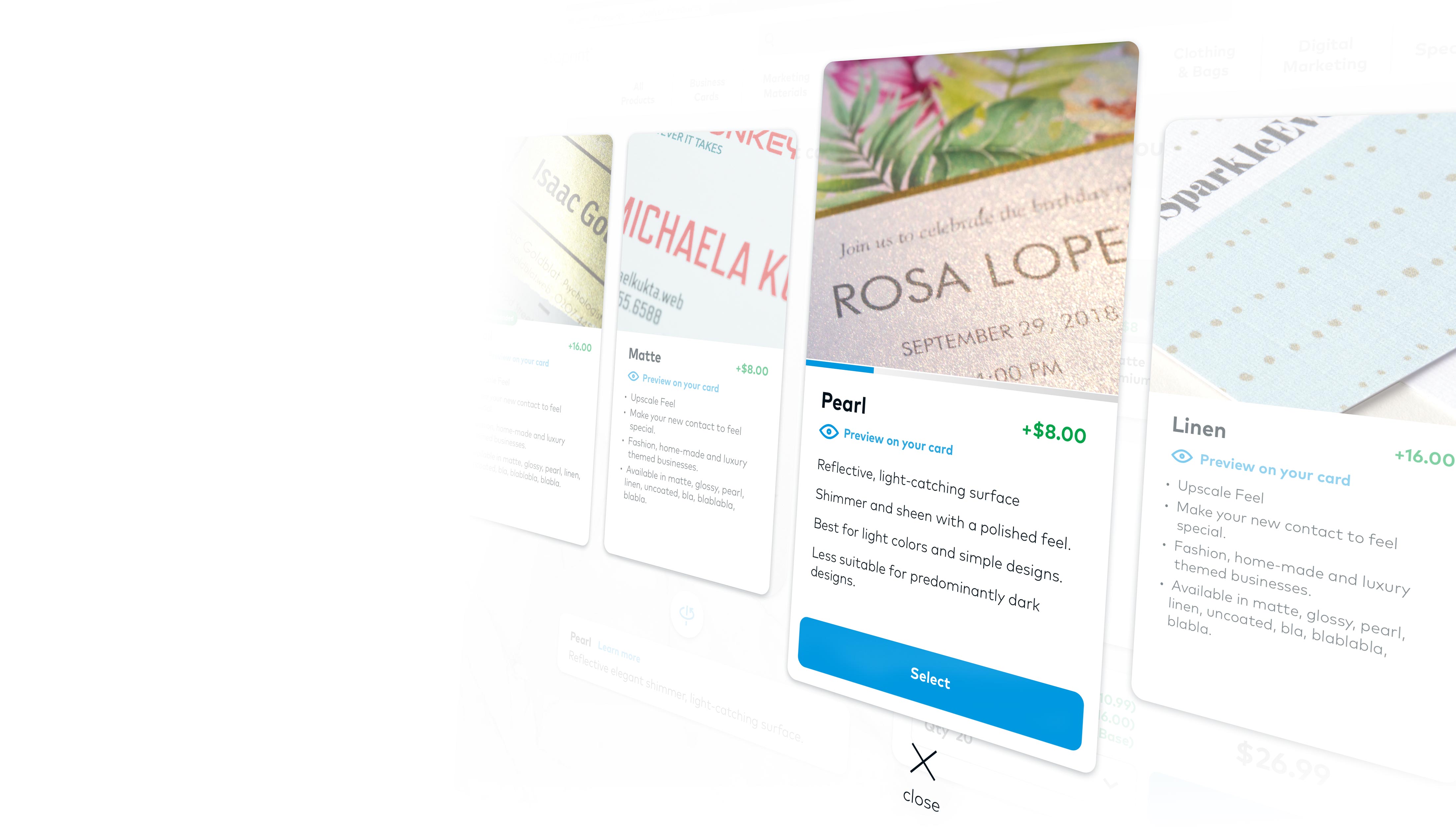
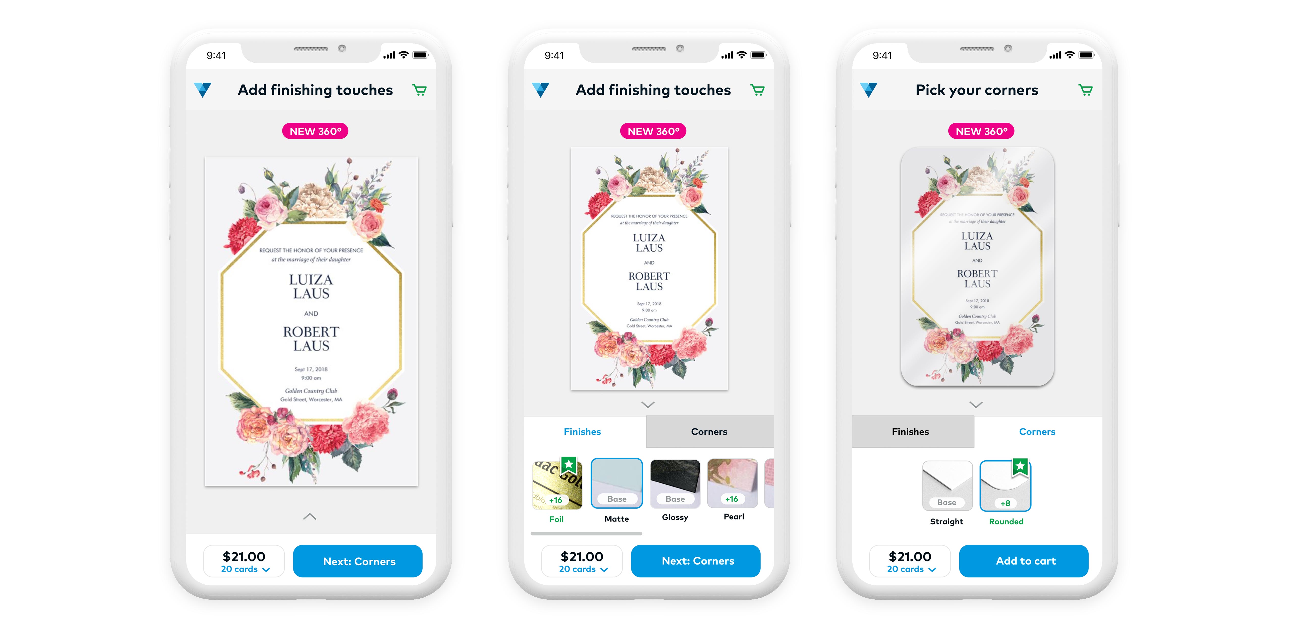
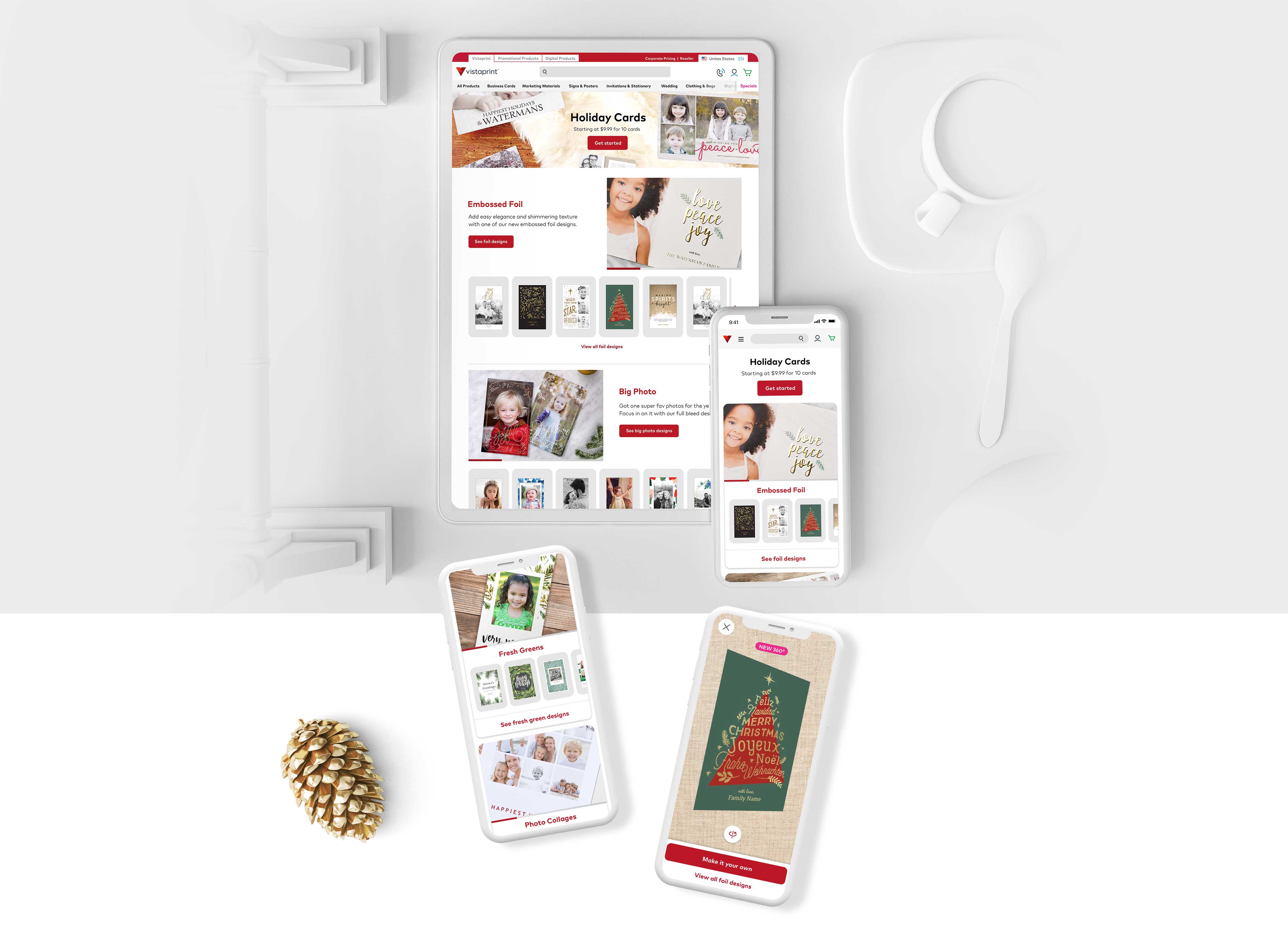
With me as the sole designer, our squad focused on making it easy and fun for our customers to order holiday cards for 2018. Compiling past research with our own, we removed steps upper funnel shortening the path into design mode and left upgrades and options to later in the optimum celebratory moment when users would be able to enhance an already happy experience. This project achieved outstanding performance metrics as well as earnings as well as providing the business with a platform from which to scale and improve configuration flexibility.

Holiday cards


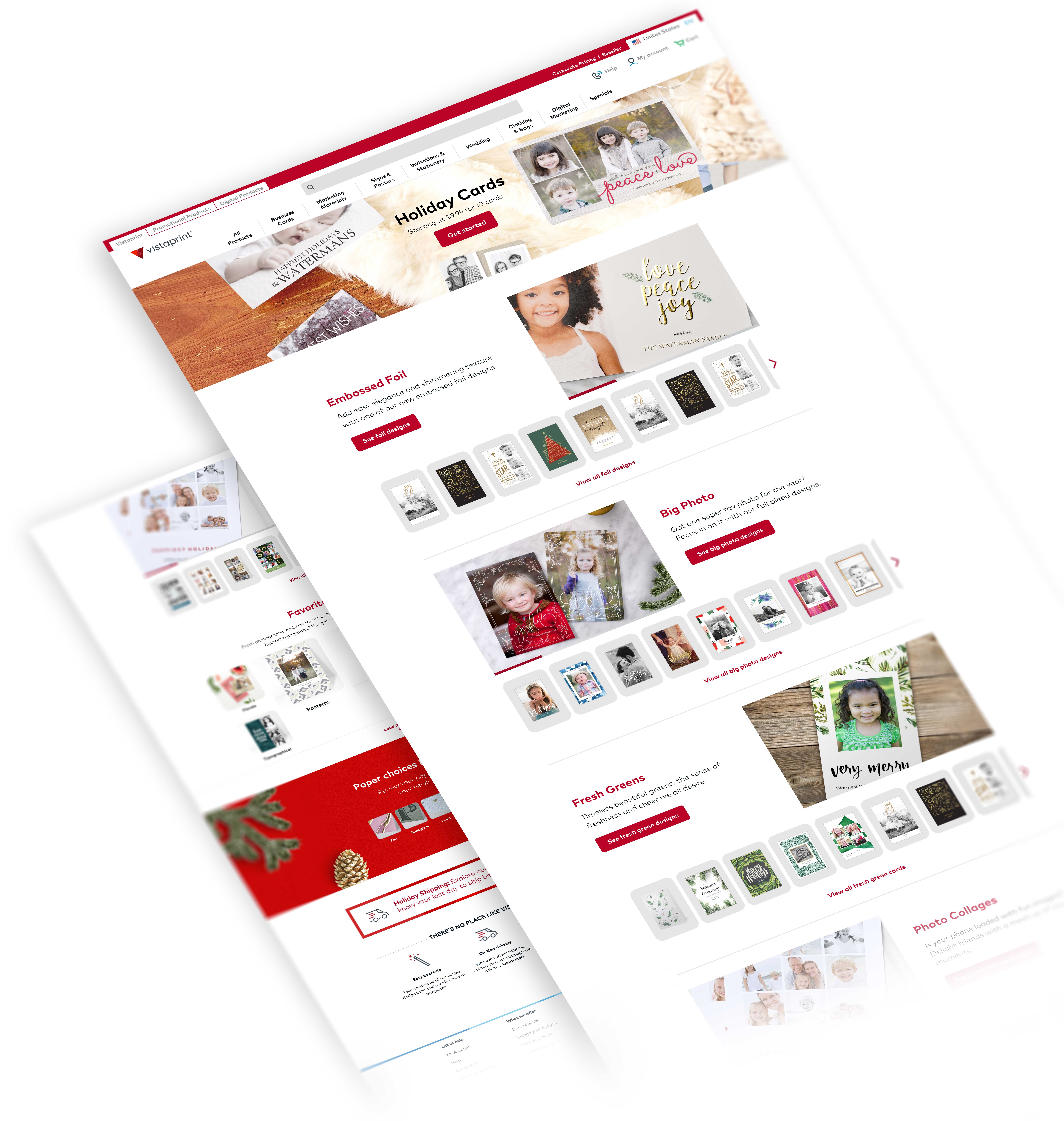
In the efforts of fine-tuning our 2018 holiday season, we explored ways to improve on ongoing projects and generate customer excitement by surfacing inspiration earlier in the flow. This was a follow up to the idea of minimizing user’s time and cognitive investment before customers start designing. We achieved this by surfacing relevant and fresh designs, highlighting common and contrasting use cases while also playfully minimizing pogo.

Banners – Guidance and Comparison


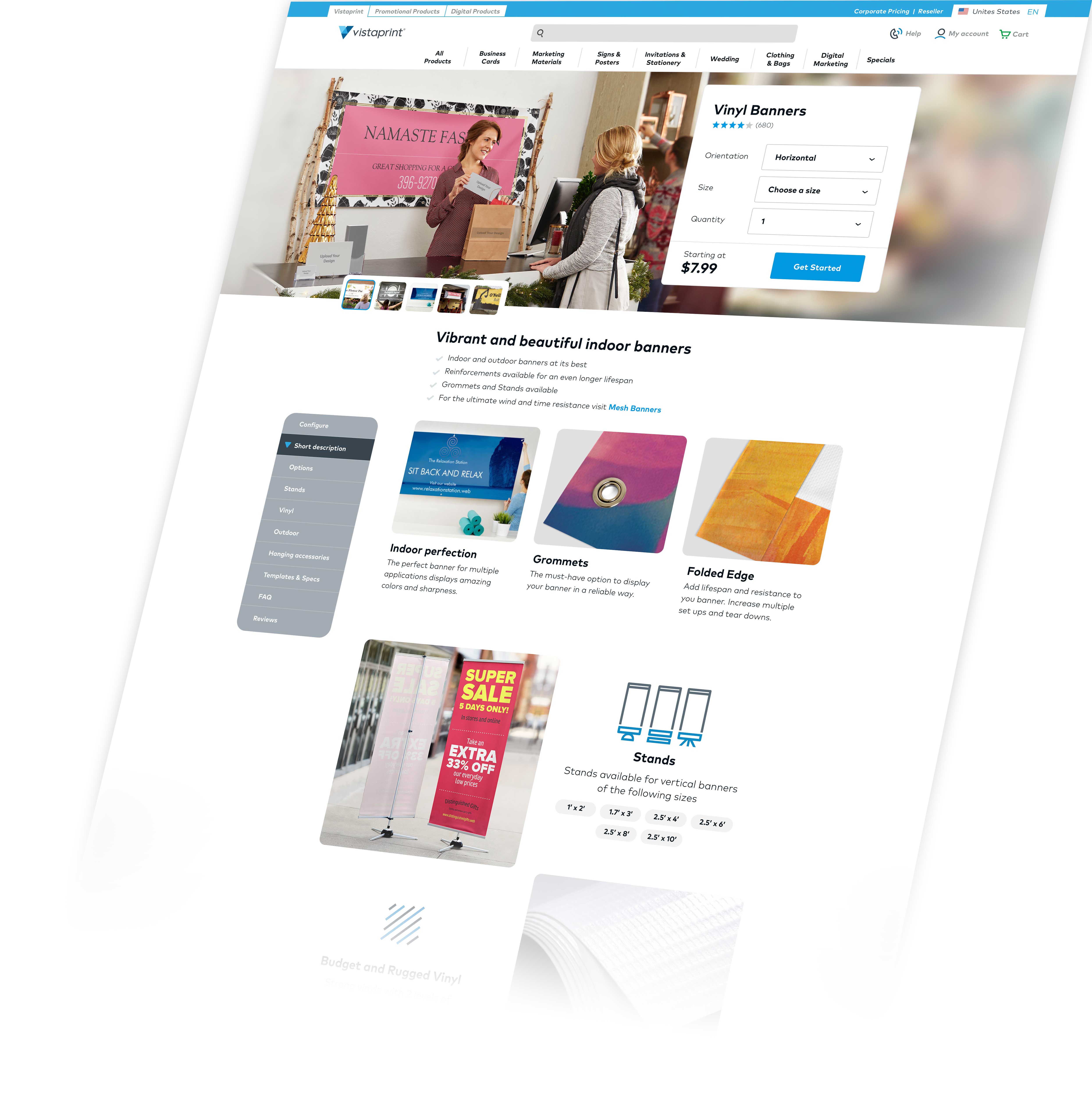
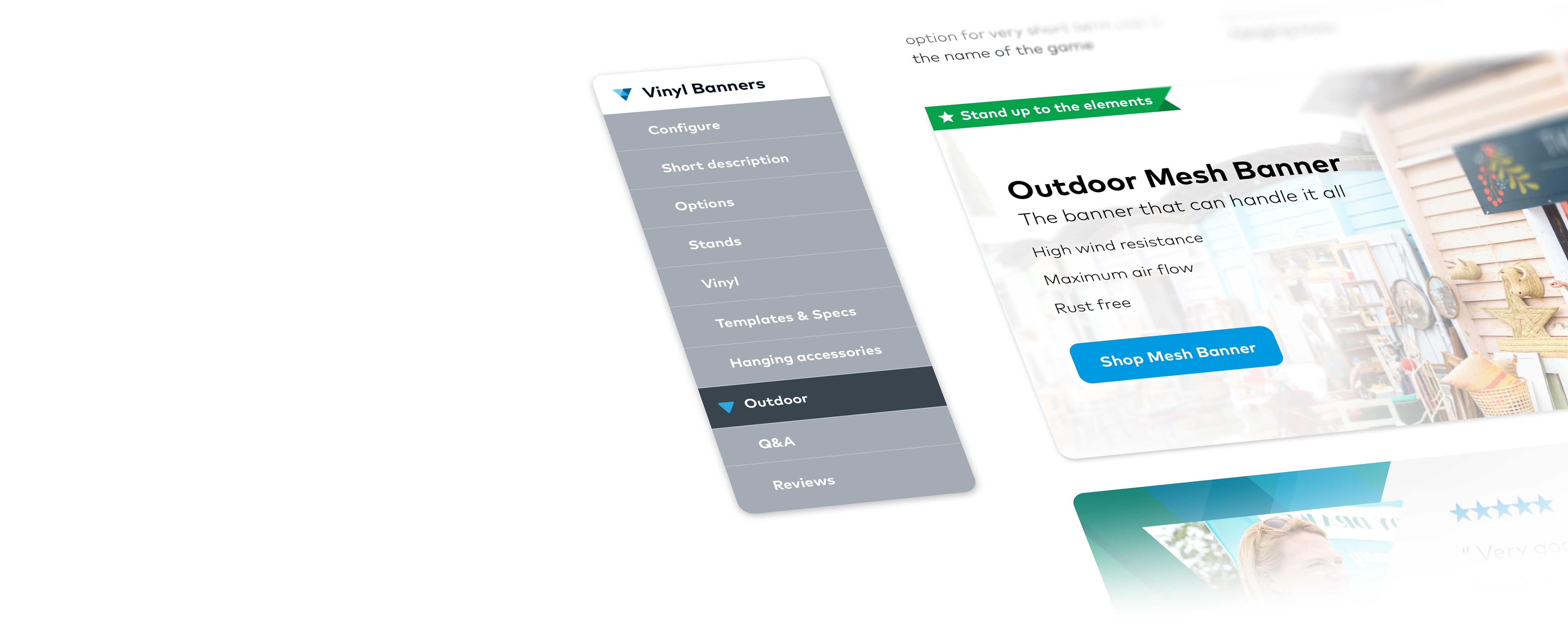
After co-leading a series of design sprints, I had the chance to id and implement some of the learnings and squash pain points previously hidden inside the signage category. By tweaking the URL tree, slowing down the flow to correct product misunderstandings and succinctly providing comparison points, we were able to improve user success and bring a good “chunk of change” into the category earnings for FY18.

Clothing & Category Authority 


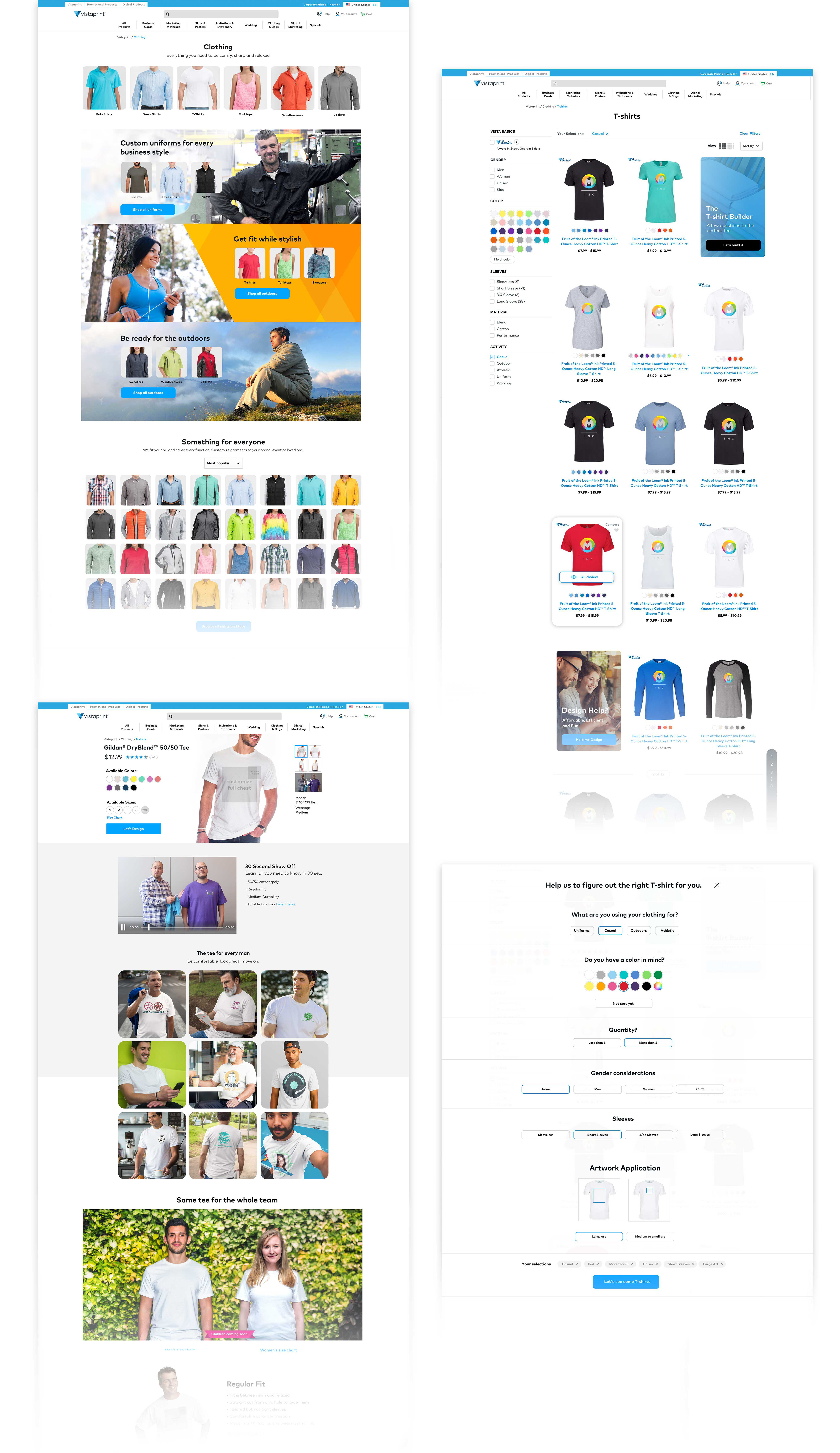
I co-lead this series of design sprints tailored to understand how clothing customization, assortment, and the small business market come together within a large enterprise as opposed to a niche company. We studied assortment levels, credibility, ways to shop, printing technologies, visual communication of product, video, and brand voice. We did online and in person user research using mock-ups and product touch and feel preference tests.


Thank you

for keeping up with the long scroll.

😉